Case study
GrainGuys Logo
A craft-led logo and lockups for a Birmingham handyman — clear mark, wordmark, and applications for kit and web.
- Logo mark
- Wordmark
- Lockups
- Application mockups
Brief
One craft mark for a trade brand
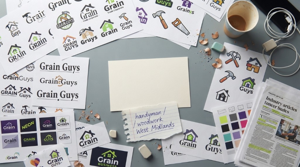
GrainGuys needed a clear identity for handyman and woodwork across the West Midlands — something that reads as skilled and local, not generic clip-art tools.
Explore
Sketches before the system
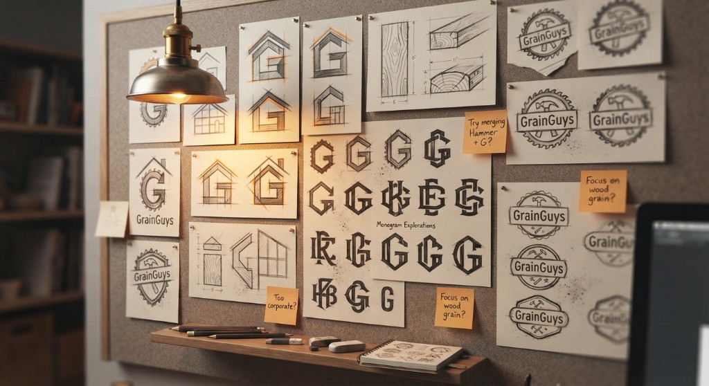
Early work tested monograms, house silhouettes, tool badges, and wood-grain studies — looking for a mark that could sit on a van, a polo, and a phone avatar.
Directions
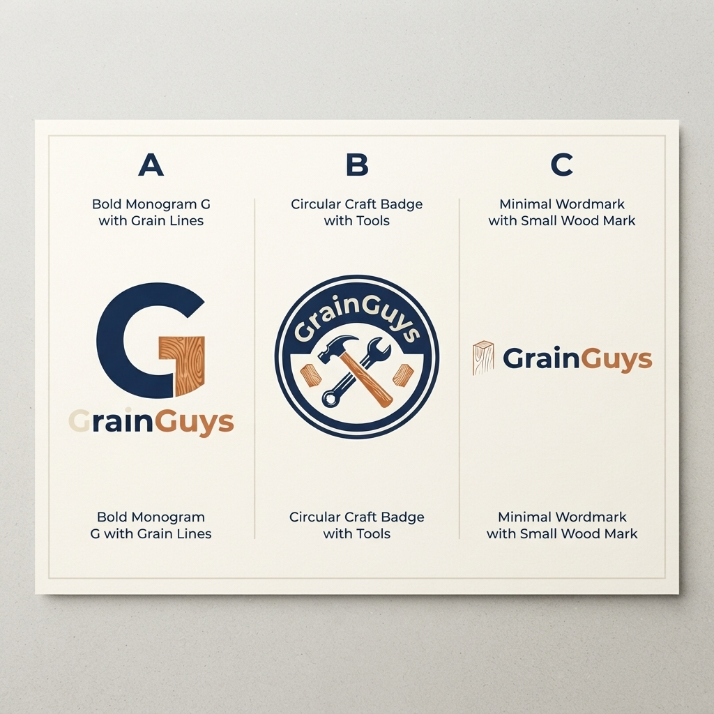
Three routes on the table
Shortlist: a bold wood-grain G, a circular craft badge, and a minimal wood mark with wordmark. Pick a path before refining geometry.
A strong G with wood grain in the crossbar — clear at small sizes.
Build
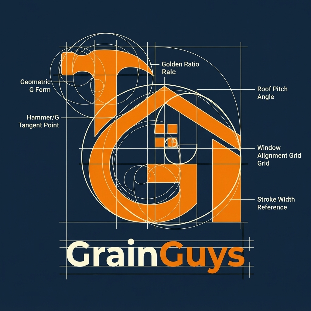
Hammer, house, and measure in one G
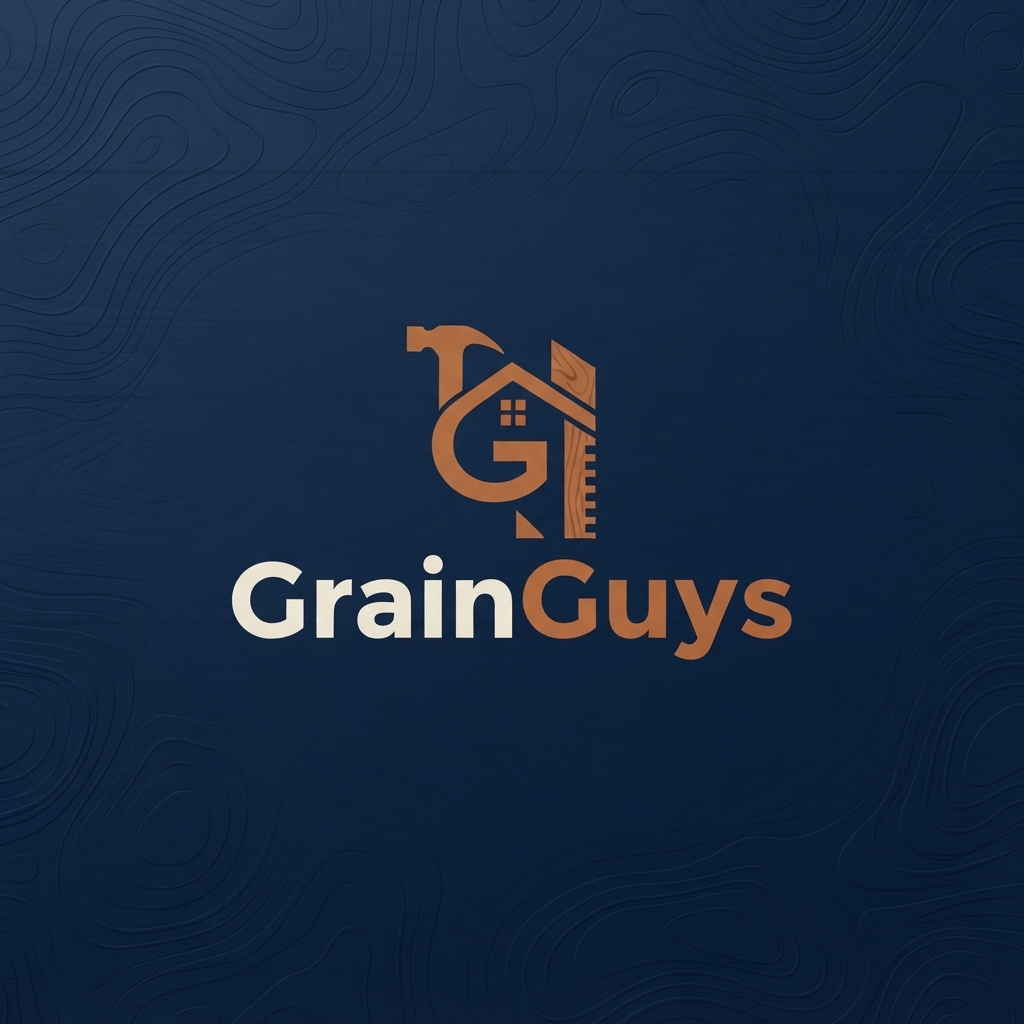
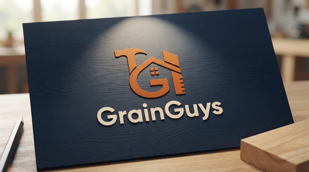
The chosen mark combines a hammer cue, a house window, and a measuring edge inside a geometric G — readable as craft and home services at a glance.
System
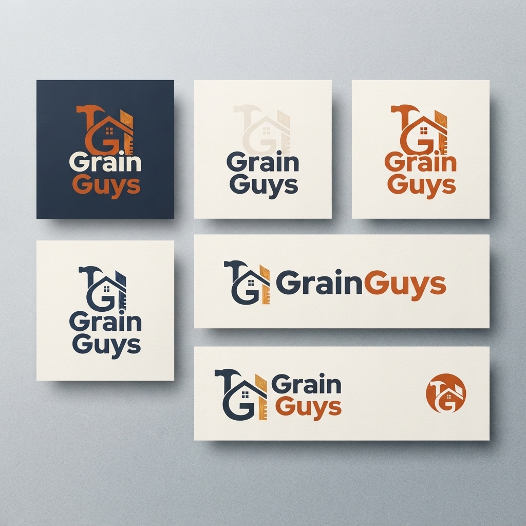
Lockups that travel
Stacked, horizontal, and icon-only versions keep the mark usable on navy, cream, and small digital crops without redrawing every time.
In use
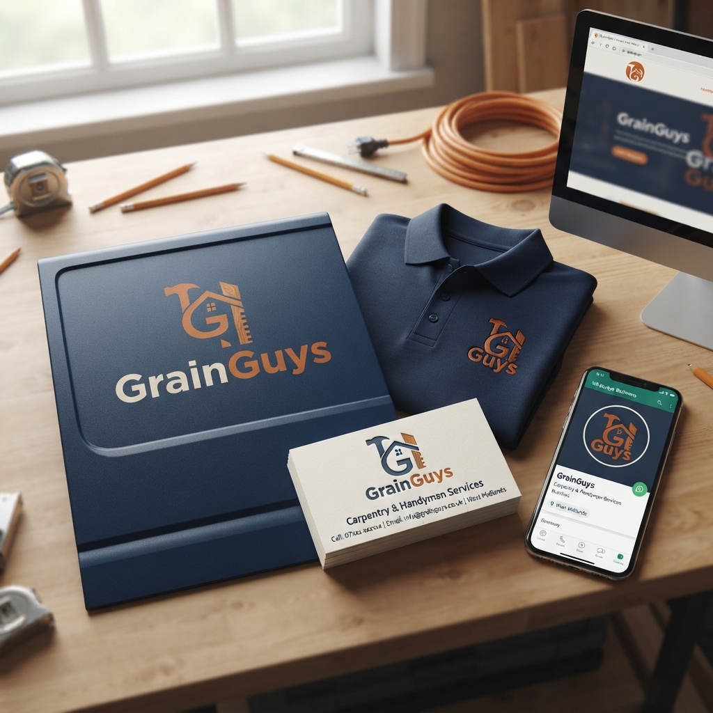
From kit to screen
Application frames show the mark on folder, polo, cards, and digital profile — the same craft orange and navy language as the live site.
The mark
Finished identity
Primary lockup on navy, plus a grain-board presentation of the embossed mark — ready to sit beside the GrainGuys one-page website.
Next
See the mark on the site
The logo feeds the live GrainGuys one-pager — same craft accent, clearer recognition from first visit to quote.